
As one of the first posts on here, I wanted to cover the inspiration, ideals and reasons for the website’s current design. I’ve always been interested in abstract design, textures and vibrant designs, but eventually, I wanted to move on from that, and practice new things. Here, I’ll explain the design process as well as problem solving.
Goals in mind
There were may things I had in mind for the website from the start; not only was it to be a portfolio but also a shining standard of what I am capable of, as well as to show I am keeping to contemporary design and looking further into the future, as to give the current design longevity. In full, the website had to be the following…
- Responsive — the website had to be responsive as I wanted to cover as many devices as possible, but also knowing a lot of people use tablets and smartphones so it’s accessible to them.
- Retina-ready — when this website was being made, the Retina Display and HiDPI displays were becoming more and more common, so of course solving the problem of HiDPI quality graphics could not be ignored.
- Simple — I cannot express this enough. I was always a fan of rather creative and ambitious designs, but I felt this site had to be more straight to the point rather than be too distracting.
- Cross-browser — I have the discipline that while you can do a lot with CSS3 and HTML5 now, do as much as you can for the typical Internet Explorer visitor. While I don’t believe IE isn’t that big a deal anymore, I’d like to believe we should still be providing an experience for it, or even so much as provide them something to switch their browser to something better rather than a completely broken website.
- Accessible — as well as being responsive, I wanted to make sure the website did not prevent people from accessing anything, or stop them from getting to important content. Pretty much following Zeldman’s principle. The last thing you need is someone reading your content from another portal!
With all of these ideals in mind, off I set into the great and perilous yonder of what is known as “designing your own portfolio”. If you’re a web designer like me, I’m pretty sure you know what I’m talking about at this point. Designing client’s websites is one thing. Designing your own is beyond impossible.
Ideas and Inspiration
I originally intended to be more vibrant with the design, but then I thought being minimal was a much better direction. Making proper use of typography, lines and the grid rather than rely too much on texture alone. It also helps when making the website responsive, but at the same time, keeping type as a focus so there’s little distraction to the content.
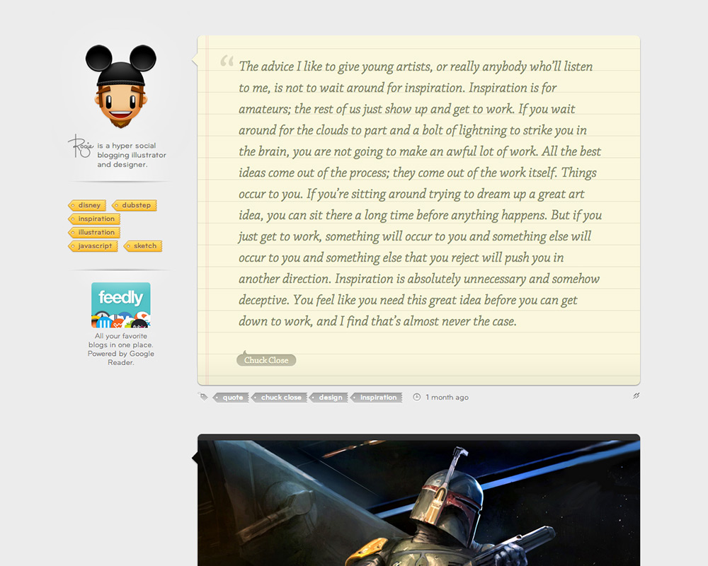
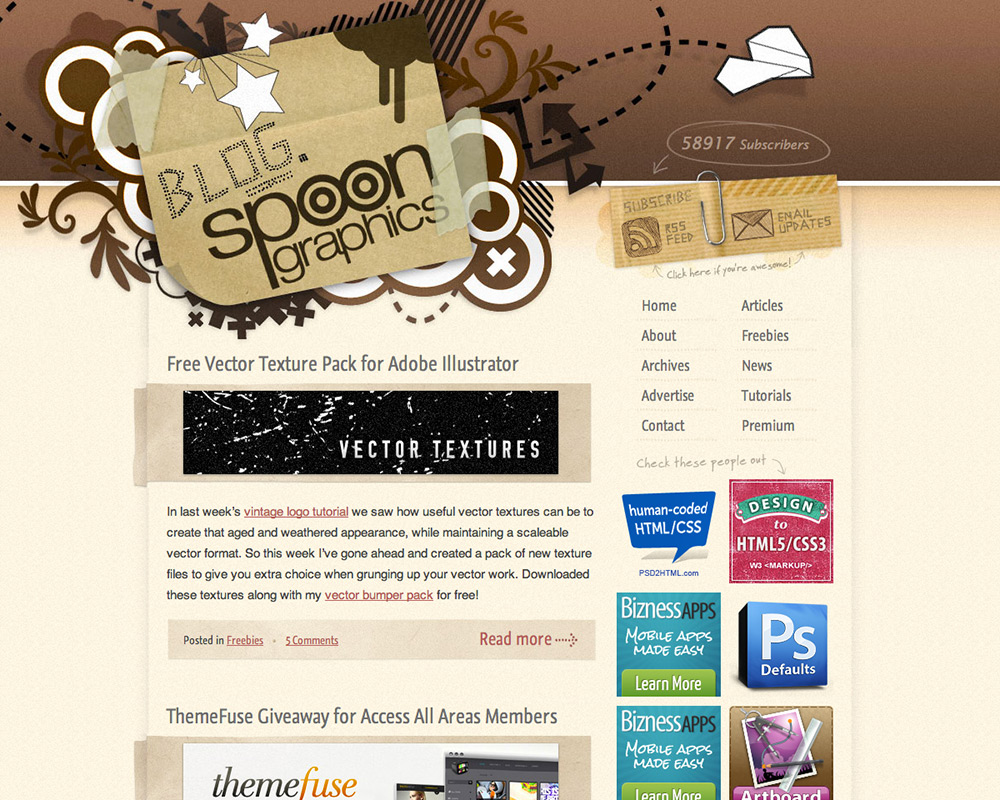
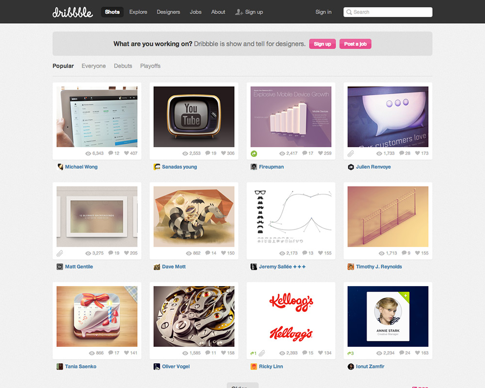
A lot of inspiration for this came from sites of established designers, such Dan Cederholm, Trent Walton, Rogie King, and SpoonGraphics. For the Portfolio, I was inspired by Dribbble for the portfolio layout and then adding my own twist to it; I liked the idea of having 3 posts in a row at best, then have 2 in the 800px view, and one at the smallest view.
Initial Design
I started out the design with sketching down the initial layouts, to keep in mind what they look like per view. I then mocked up the visuals in Photoshop as I usually do, and I laid out the site using the 960 Grid System, which is one of my favourites. I also used this opportunity to try out Adobe’s new Open Source font, Source Sans Pro. I originally intended to use something close to Grotesk or Geometric type, such as Proxima Nova or Freight Sans, but I liked the design of Source Sans as both a heading and body font I thought I’d use it across the whole site. It’s worked very well and looks very nice as a body font.
I also wanted to try out Meta Serif Pro for certain headings, as well as blockquotes, as to mix in some serifs amongst the dominating sans–serif.
Retina First
I thought I’d explore using rasters for the Retina Display, and HiDPI devices. Of course, the challenge for rasters, unlike SVGs or Icon Fonts, is you can’t scale them up for @2x displays, as rasters are resolution dependent. So instead, I thought I’d make certain graphics (backgrounds, the logo, social icons) the larger size first then scale them down on the initial Photoshop mock up. That way, I was prepared for getting them Retina ready and have have normal quality images ready as well.
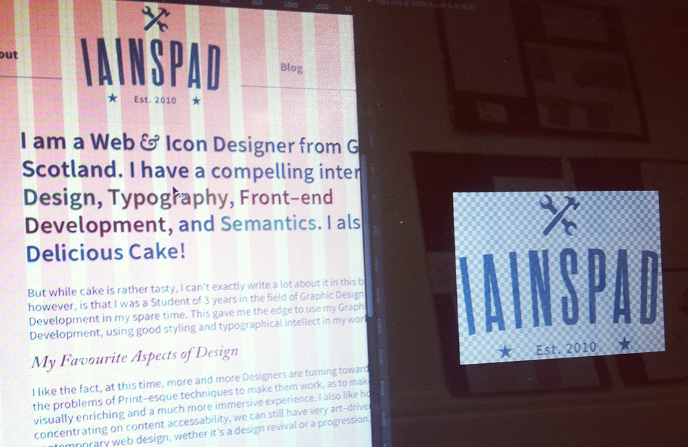
Retina Graphics are the future! The logo was made twice as big first, then in the mockup was scaled down by 50%.
During development, I would put the Retina graphics in a seperate retina folder in the images folder, as to keep them all seperate from the scaled down graphics kept in the images folder, and using the regular graphics first, then using a CSS media query for pixel ratios to replace the normal graphics with higher quality ones.
Mobile First Responsiveness
I was compelled to go into the Mobile First direction, mostly inspired by Dave Rupert’s slideshow on Flexible Media in Responsive Web Design as to code the Mobile Display first, then work its way up to the desktop, as well as keeping responsive media in mind. The only worry I had halfway down the line coding was doing it for IE 7 and 8, because this is Mobile up, not Desktop down. However, by adding respond.js, IE 7 and 8 can respond efficiently and use the larger screen styles rather than not work with a mobile first stylesheet. All that needed solving then was little bugs IE 7 and 8 are persistent on doing, as usual.
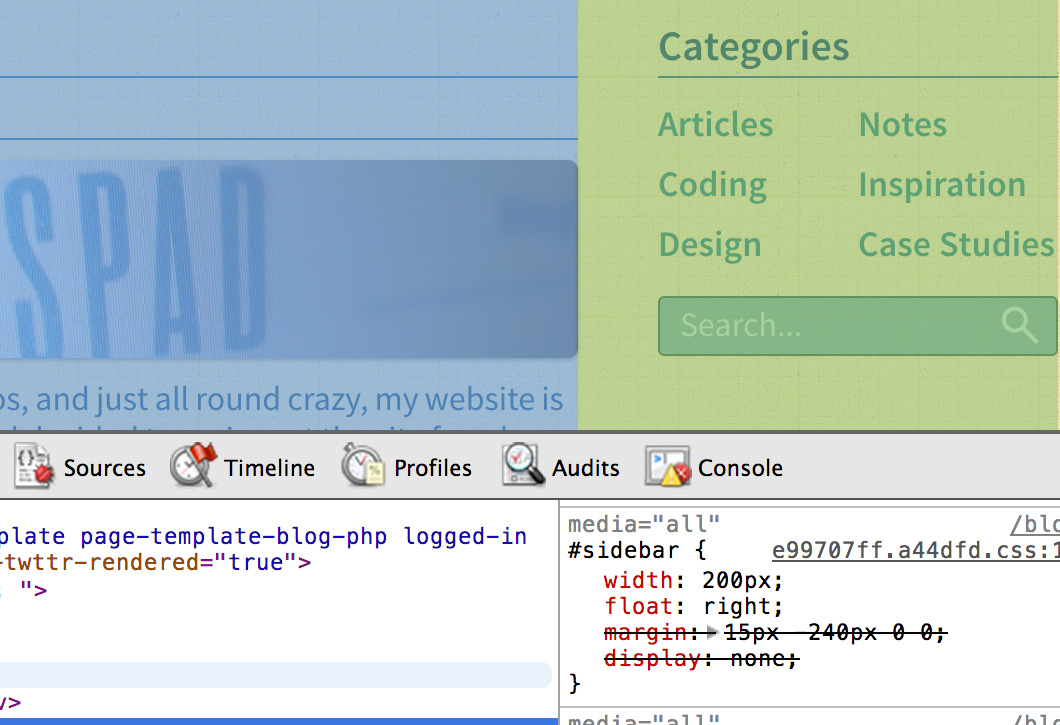
A fixed sidebar in a responsive design? What is this madness?!
This is also where using a simple design comes in handy, as Responsive Design isn’t that hard if you keep things simple. I just kept a simple layout, with a few tricks for fixed sidebars. Yes, I know, you’d rather percentages, but bear with me. I’ve always found Responsive sidebars a bit funny (not that there’s anything wrong with that), so I decided to keep it easy. The trick was to use padding on the element containing the content and the sidebar, then float the sidebar and use a negative margin to push it into the padding area.
Getting WordPress to work as a Portfolio and a Blog
One of the problems of the website as a whole was to get it working as both a portfolio and a blog at the same time, while making separate posts in the portfolio and ones for the blog too, so there’s two types of post to display. However, this was easily solved. The portfolio was displayed as the default home.php file, while the blog had a custom page template with a custom loop using query_posts(); while excluding the Portfolio category. However, in the single.php file, I needed to separate the two different post types. This was easily achieved by making a PHP condition stating if it was in the portfolio category, it would display the needed markup, and anything else was given separate markup, as you can see from the blog.
<?php $post = $wp_query->post; if(in_category('Portfolio')) { ?>
	//Code for Portfolio Items go here
<?php } else { ?>
	//And all other posts get code from here!
<?php } ?>
Using the above code, I can target the posts in the Portfolio category, and anything that isn’t in that category will be given a different markup. I also did a similar conditions on places such as the archive file, as well as the search file, to prevent portfolio items from showing up in the blog search, and vice versa.
Conclusion
I thoroughly enjoyed the challenges with this current design; I really liked working on different solutions on current design trends, and issues. It’s also given me time to practice my skills on certain needs for the future, but I also had fun exploring more solutions to using WordPress and making some cool custom templates. This design proves it has longevity and I’m pretty sure it will last for a long time to come.
No Comments